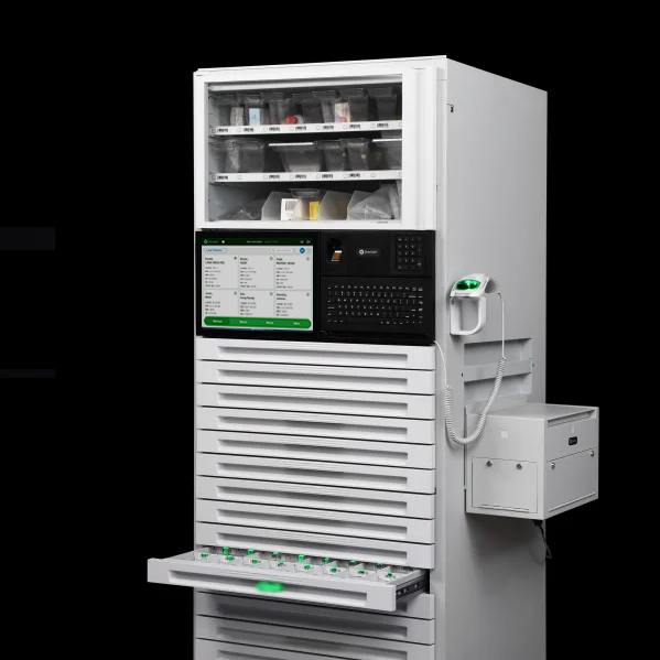
Used in more than 50% of hospitals across the US, Omnicell cabinets are deeply embedded in daily clinical routines, making reliability and consistency essential. Improving usability in this legacy system required reducing cognitive load without disrupting the workflows and safeguards clinicians already trust.
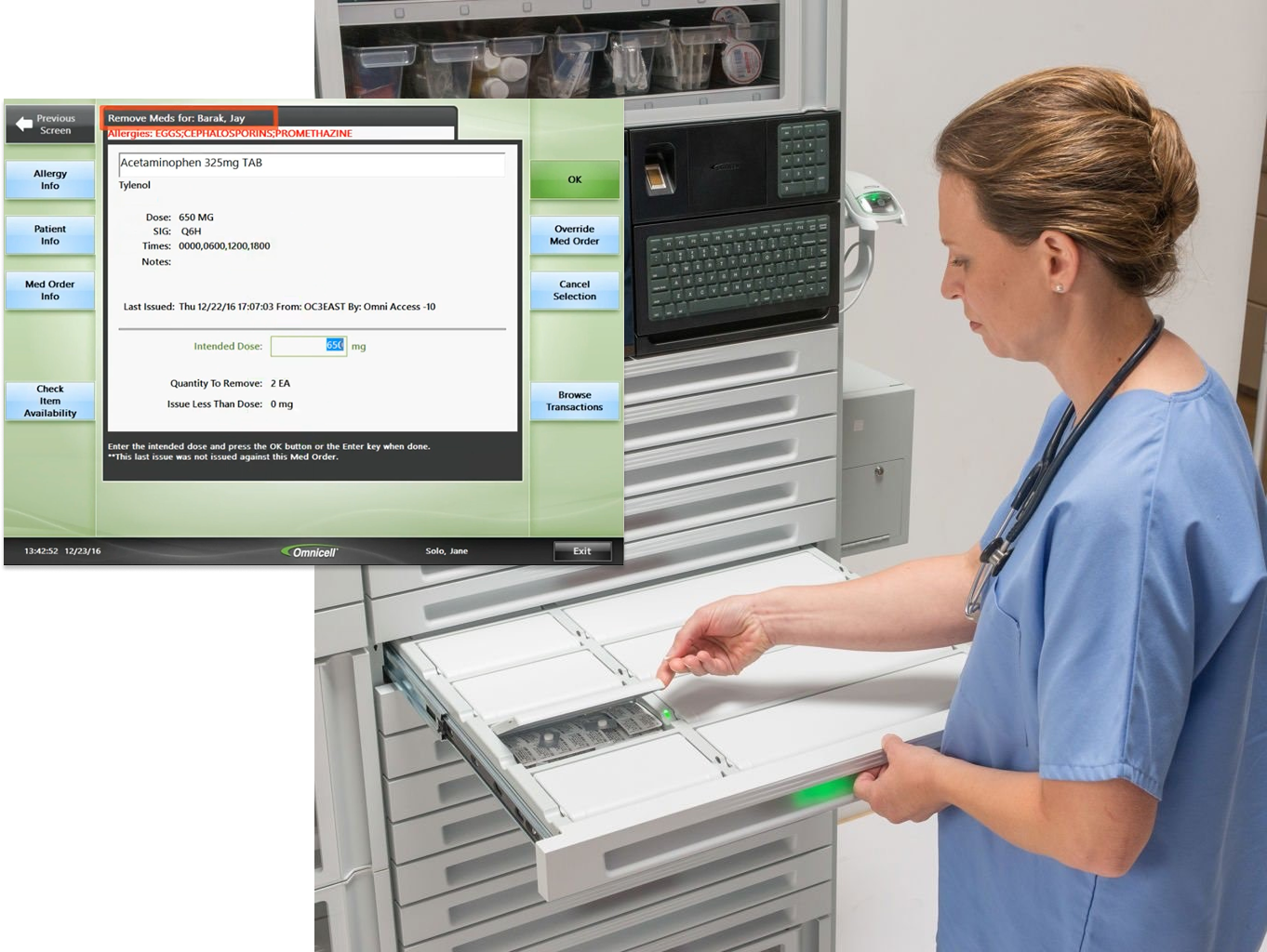
In an environment that is fast paced and demanding, nurses battle clunky software and unnecessary mental effort while performing routine tasks.
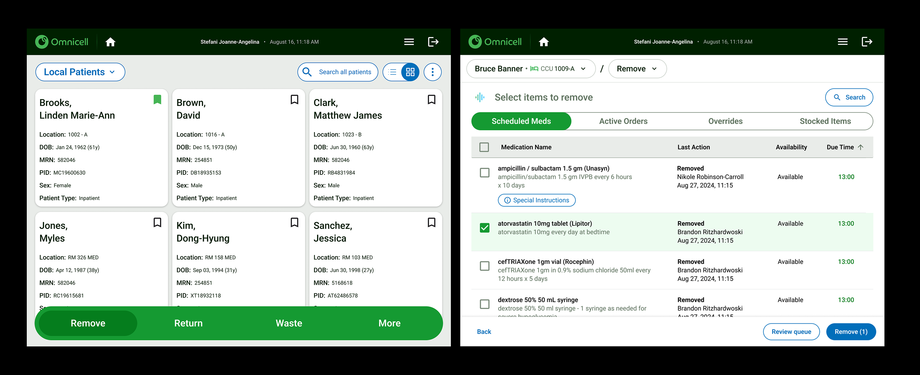
While many workflows required updates, the medication removal flow demanded the most attention. It is the primary action nurses perform at the cabinet and one of the most critical moments in patient care. The right medication can save a life, and an error can have serious consequences.
Simplifying this experience reduced unnecessary decision-making and instead guided the user, helping nurses move faster and with greater confidence.
Reworking this core workflow also allowed us to define new interface patterns, component structures, and visual hierarchies that we would later reuse across the entire system.
.png)
1. Unclear entry point: Actions are buried within multiple menu options, requiring users to pause and recall the correct sequence before proceeding.
2. Visually dense medication list: Important details like dosage or schedule don’t stand out, increasing the chance of errors or hesitation.
3. Unintuitive tab organization: Tab order doesn't match how nurses typically see or manage meds, forcing them to remember where to look.
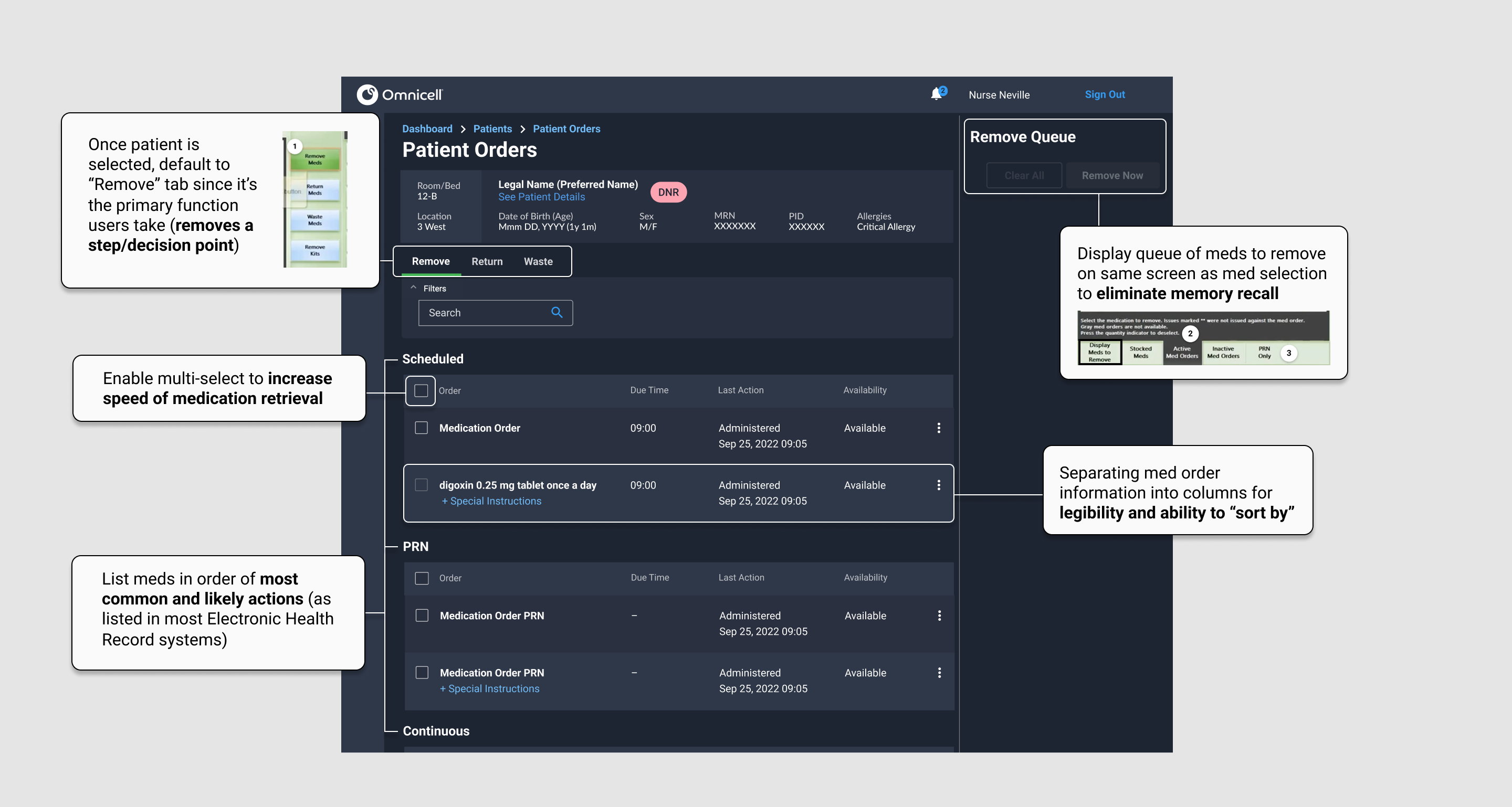
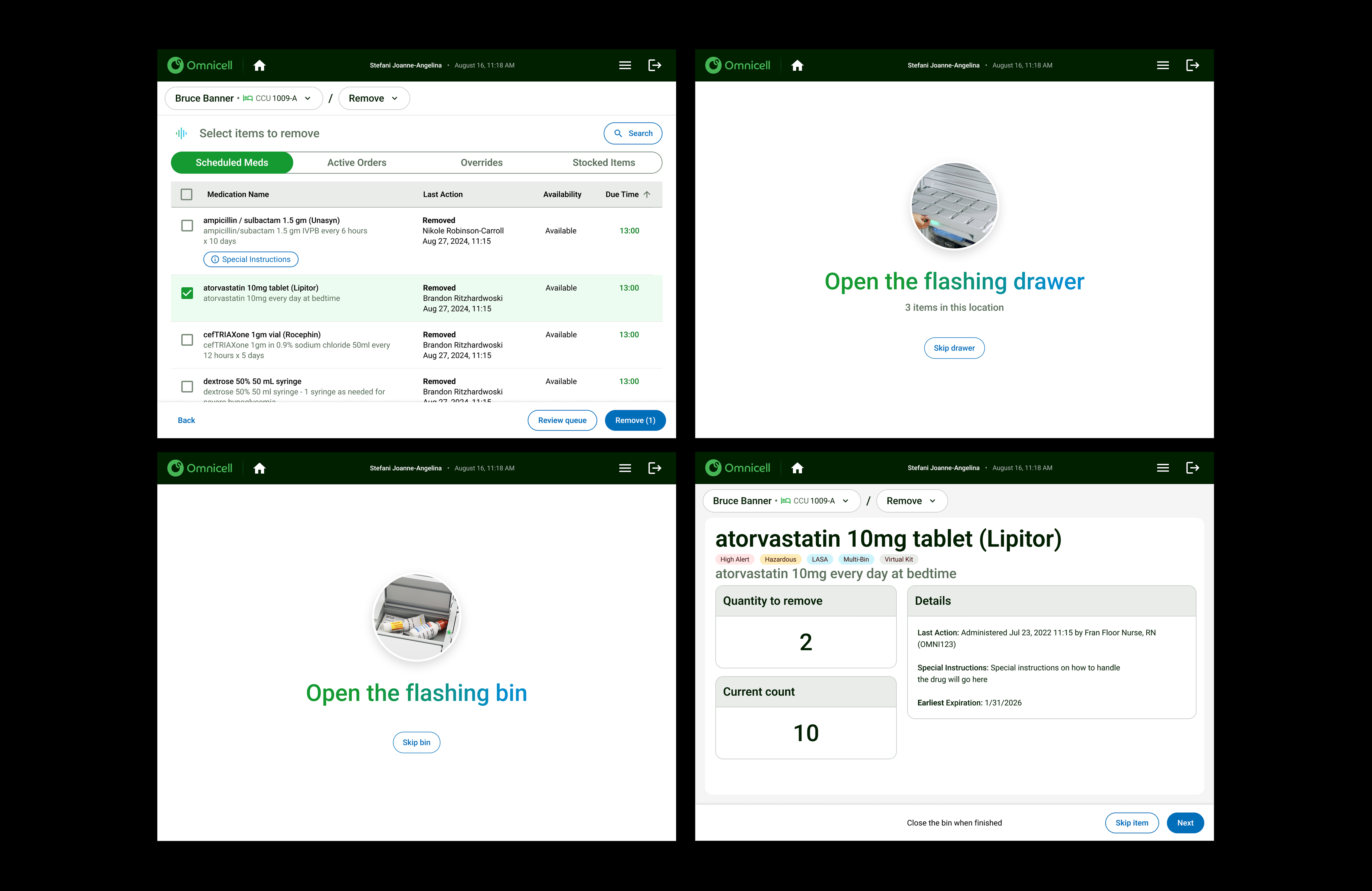
This first iteration focused on guiding nurses through medication retrieval by reducing unnecessary steps and clarifying available actions at the moment they were needed.
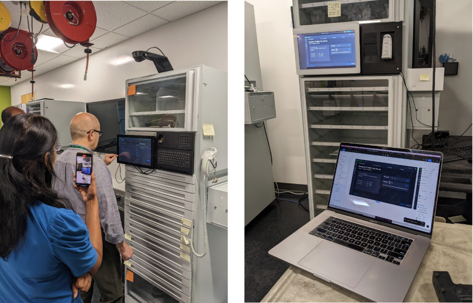
We had two nurses participate in guided usability testing, giving them mock scenarios with tasks to complete. Users had a hard time reading text on the screen, touching buttons, and scrolling through dropdown menus. The designs in our desktop app did not translate well onto our touch device at the cabinet.
It was because of this testing that we decided we needed to create a "touch friendly" design system separate from the desktop experience.

Key decisions made in this iteration included decluttering the screen of secondary information and driving user behavior through instructions and visual cues that mimic the guiding lights nurses are accustomed to.
The final design provides clear guidance through medication removal, reducing unnecessary decisions at the cabinet and helping nurses act with speed and confidence. Critical information is surfaced when it matters most, allowing clinicians to focus on accuracy rather than interface interpretation. By aligning clarity with trusted workflows, the experience supports safer medication practices and enables nurses to spend less time at the cabinet and more time caring for patients.