Background
Healthy Minds Innovations is a Non-Profit under the Center For Healthy Minds at the University of Wisconsin, Madison, founded by world-renowned neuroscientist Dr. Richard Davidson. One of our product offerings, Healthy Minds Program, is a free meditation app that teaches mindfulness using neuroscience-backed research methodologies. The app guides users through a 4 pillar framework to train and strengthen the mind using podcast-like lessons as well as meditation practices.
The Challenge
Outside of our 4 pillar program, we have one-off meditations that have been collected onto the Meditations page. This once temporary solution has become a long, unending scrollable list, with new activities being added monthly. We wanted to take the opportunity to not only organize and categorize these one-off activities, but also reimagine the user experience so that our content is more discoverable and so that the design can scale to accommodate more content in the future.
The Process
Healthy Minds Innovations is a Non-Profit under the Center For Healthy Minds at the University of Wisconsin, Madison, founded by world-renowned neuroscientist Dr. Richard Davidson. One of our product offerings, Healthy Minds Program, is a free meditation app that teaches mindfulness using neuroscience-backed research methodologies. The app guides users through a 4 pillar framework to train and strengthen the mind using podcast-like lessons as well as meditation practices.
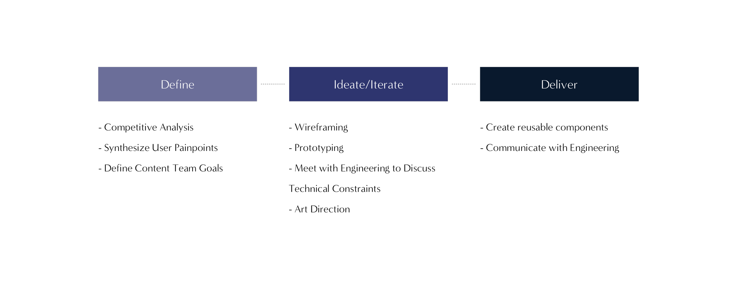
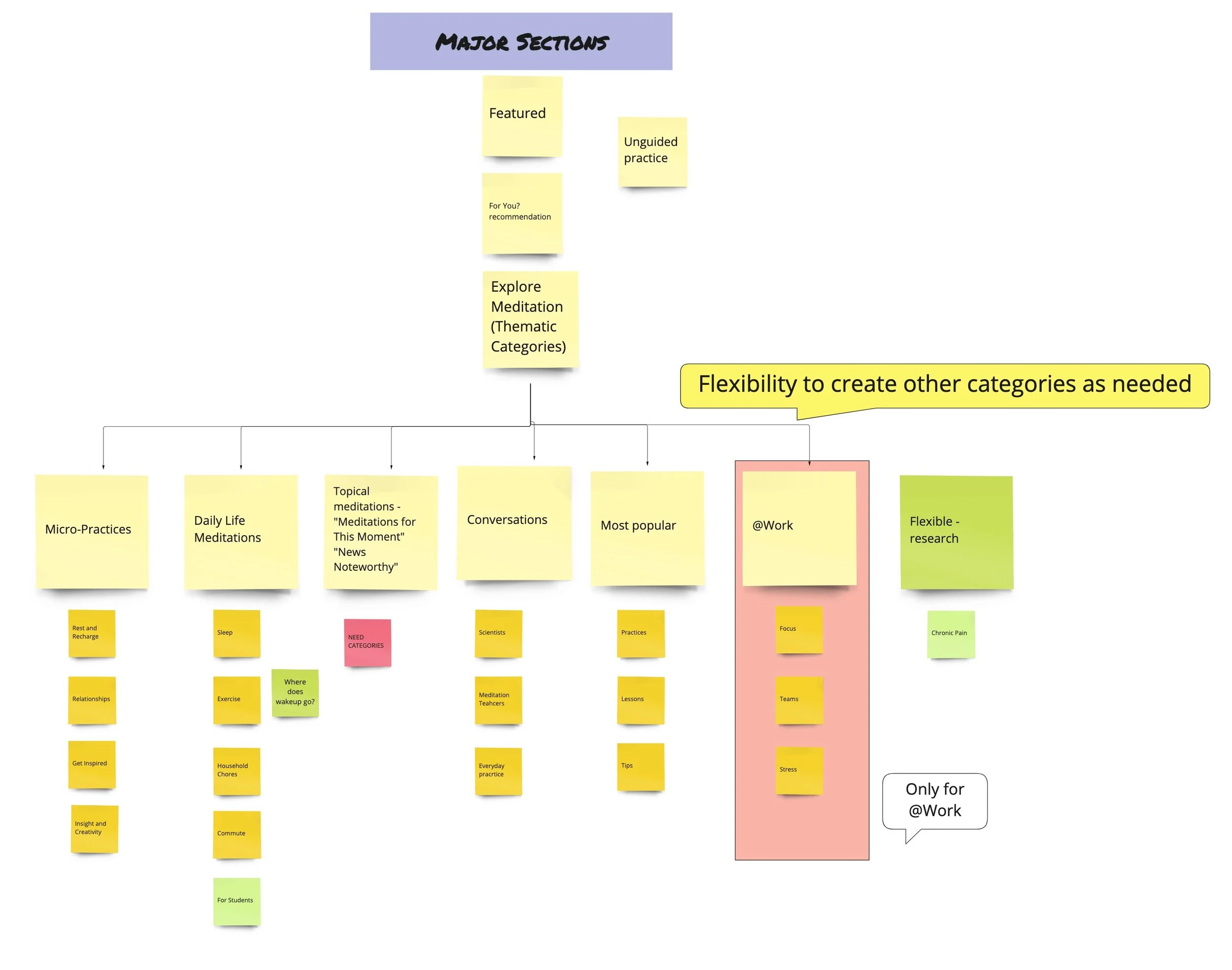
Discovering How to Organize and Categorize Content
The first thing I did was look to our competitors in the mental wellness space to see how they organize their content. By looking at other apps, I had a better picture as to how I should organize the information architecture of our Explore page as well as the types of categories I should include.
Apps such as Headspace, Calm, 10 Percent Happier, and Insight Timer use different methods of categorization including:
Mood
Duration
Topic
Experience
Level
Alphabetically
Trending Searches/Popular
Reading Zendesk Tickets To Uncover Opportunities
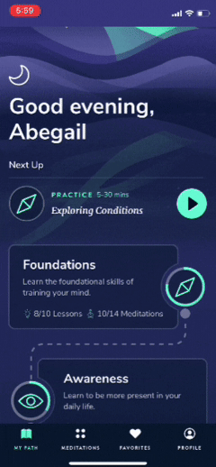
I read through 100+ Zendesk reviews to see if there were any opportunities to solve user complaints with this new feature. A common thread between comments have been that users weren’t able to find content easily. As you see in the screenshot below, Healthy Minds Program is sequential in nature. The app was built to take users on a mindfulness journey, where they first learn the foundations of meditation, and then build upon their skills as they navigate through the four modules - Awareness, Connection, Insight, and Purpose.
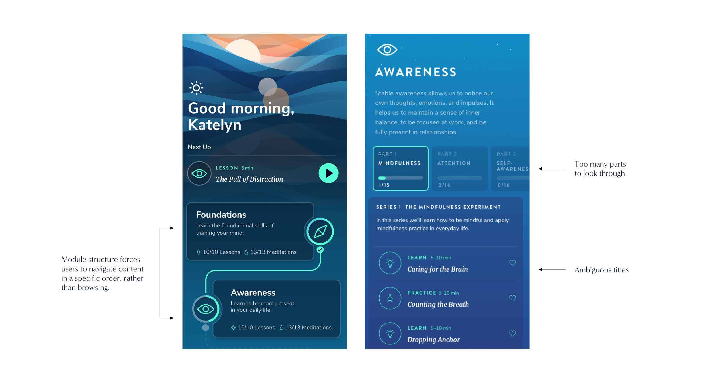
This sequential structure has made it difficult for users looking for a specific type of exercise. Users have expressed that they are unable to find a meditation that they’ve listened to, and would like to have easier access to them. Other tickets from users have expressed that the titles of the exercises in the app are ambiguous, and therefore difficult to assess whether or not the content would be relevant to their needs. With this in mind, I wanted to create categories that were straight forward so that users don’t have to scroll so much before finding something to listen to.
Catching the Vision of the Content Team
This sequential structure has made it difficult for users looking for a specific type of exercise. Users have expressed that they are unable to find a meditation that they’ve listened to, and would like to have easier access to them. Other tickets from users have expressed that the titles of the exercises in the app are ambiguous, and therefore difficult to assess whether or not the content would be relevant to their needs. With this in mind, I wanted to create categories that were straight forward so that users don’t have to scroll so much before finding something to listen to.
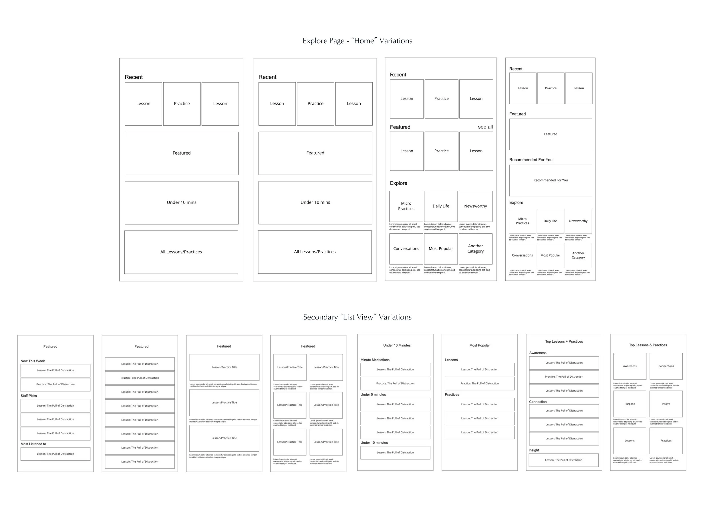
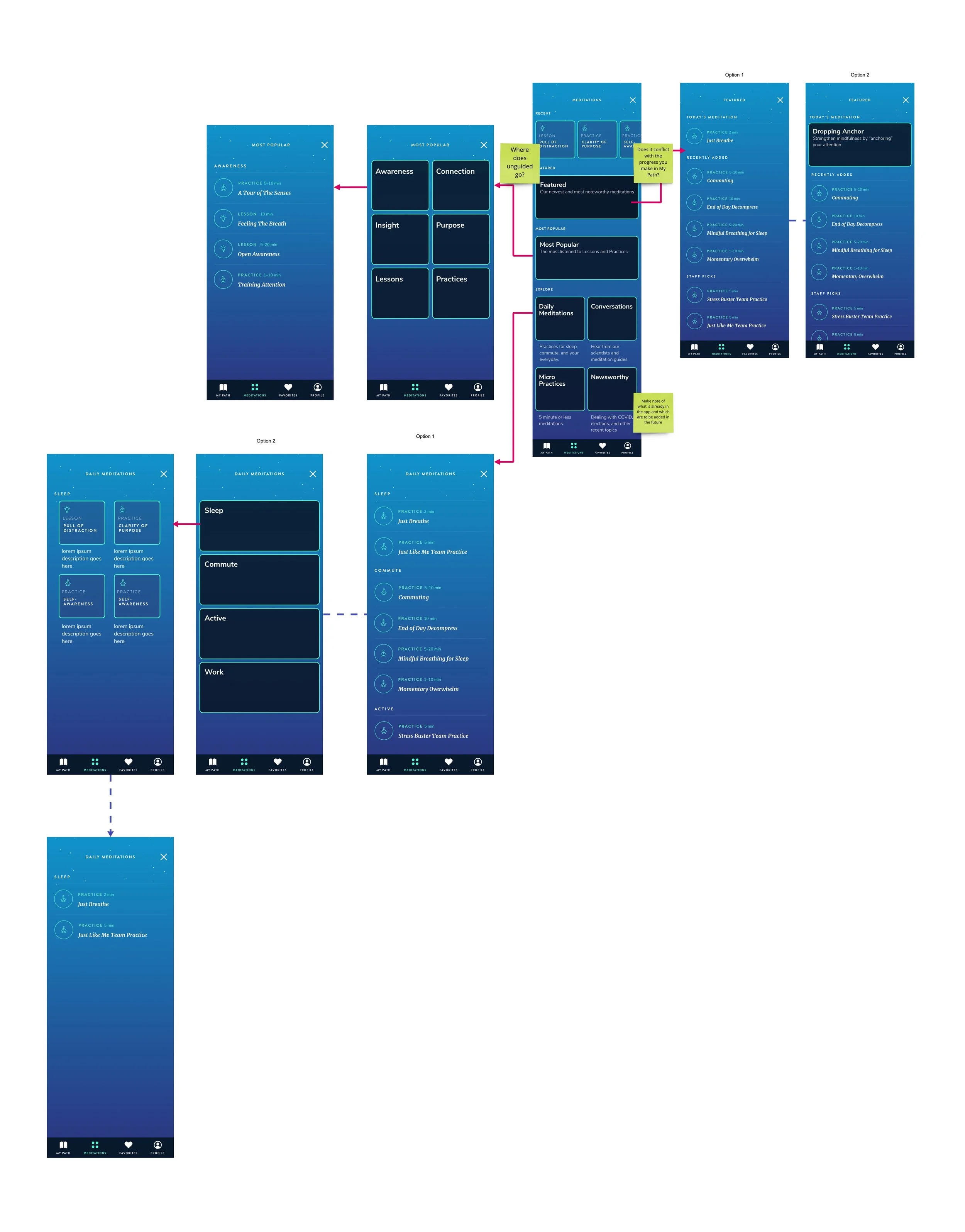
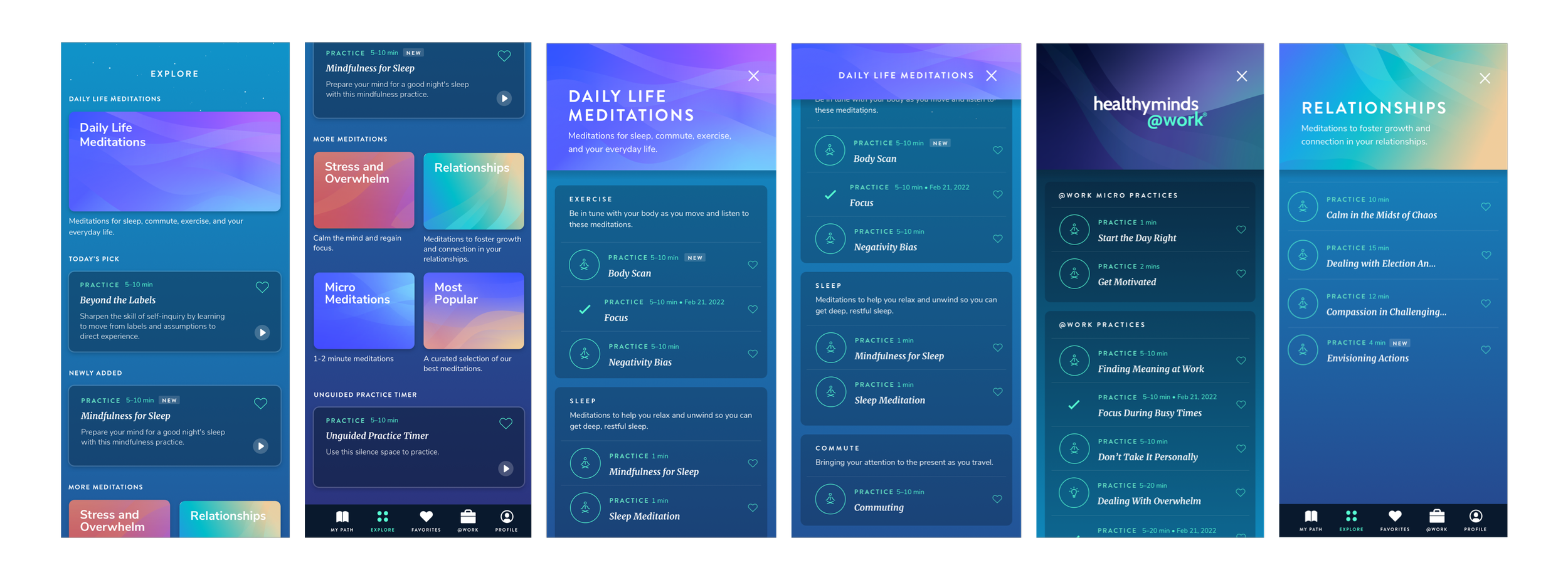
Modular Wireframes That Scale
There were two pages I needed to design - the “Home" page for Explore, and a list view for activities once you click into a category. The goal for the home page was to create a variety of modules that could be mixed and matched as the product grows.
Optimizing the User Flow
After creating dozens of wireframes, I switched to mid-fidelity and tested out some potential user flows. A problem that came up was discoverability. For example, how many clicks would it take for a user to find a meditation on “sleep”? The user flow below shows the thought process. During this exercise, I realized that having sub-category pages just added complexities and more clicks for users. I opted for a simpler way to display subcategories on the same page (which you will see later).
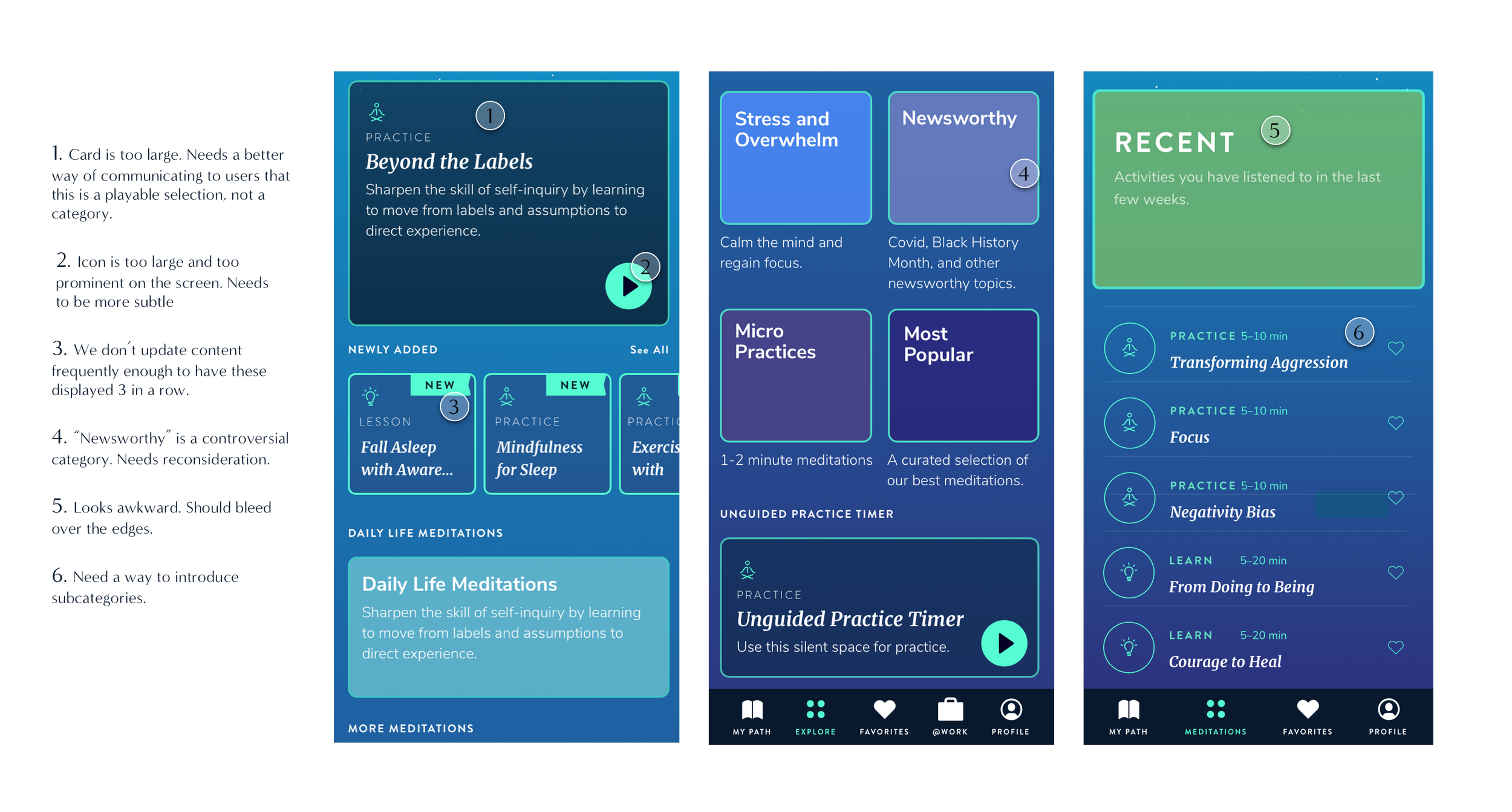
Feedback from Engineering + Design
I showed mid-fi screens in a clickable prototype to the dev team in order to get feedback on the implementation feasibility of some features. We agreed that “Today’s Pick” would come from a set list defined by the content team rather than being programmatic. We were also able to align on repeating patterns throughout the app. For example, on the “My Path” page, once a user listens to an activity, it gets time-stamped with the completion date. We decided to carry this functionality onto the activities on the Explore page in both the card view and list view to create a consistent experience throughout the app. In addition, my manager gave me some feedback on the UI.
Here is some feedback given to me at a high level:
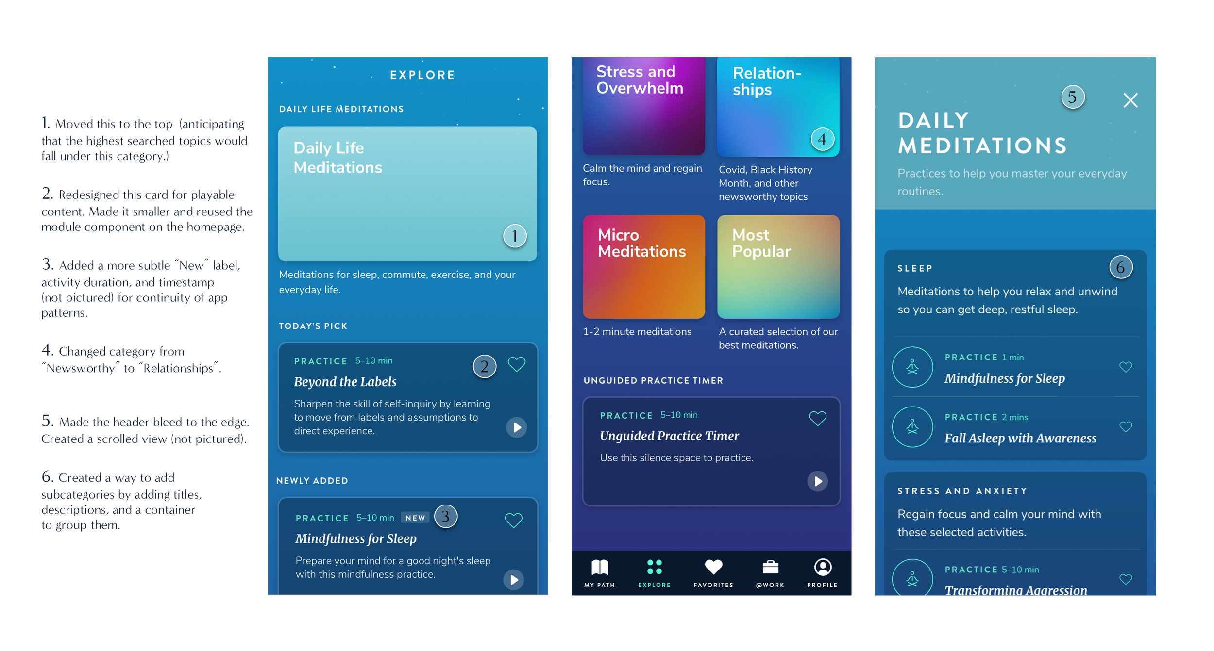
Iterations Based on Feedback…
There were many design iterations made - from minor tweaks such as removing borders and adding drop shadows, to larger implications such as rethinking the content structure and switching out categories. Overall, we decided to land on a final design and let the user data/user feedback dictate whether or not more changes need to be made once we launch the new design.I showed mid-fi screens in a clickable prototype to the dev team in order to get feedback on the implementation feasibility of some features. We agreed that “Today’s Pick” would come from a set list defined by the content team rather than being programmatic. We were also able to align on repeating patterns throughout the app. For example, on the “My Path” page, once a user listens to an activity, it gets time-stamped with the completion date. We decided to carry this functionality onto the activities on the Explore page in both the card view and list view to create a consistent experience throughout the app.
Now Make it Pop
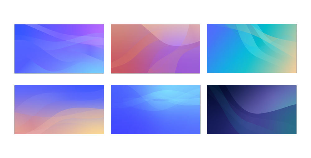
One last thing I did before hand-off was collaborate with our graphic designer to create illustrations that would be used for the different categories. We already have illustrations on our homepage, so I thought it’d be best if we could expand on our existing visual style.
Mood board for art direction
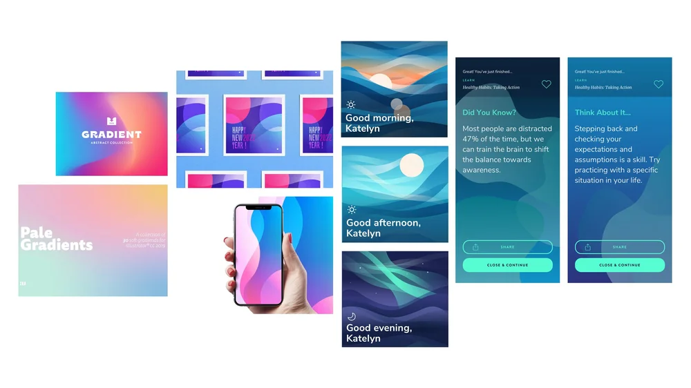
Final color palettes
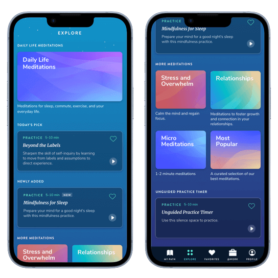
Final Design
User Improvements
Research with the Healthy Minds App showed that just
5 minutes a day of practice leads to:
-24%
Reduction in depression
+13%
Increase in social connection
App Improvements (since 2021)
70%
New downloads
Average annual growth rate
+25%
Engagement increased
Average user engagement (monthly)
+43%
Completions increased 43%
Average completed meditations (monthly)
4.9⭐️
Average rating on App Store
Final Thoughts
I’m very excited to hear feedback from users once this design becomes implemented. I think this new page is just the beginning for the possibilities of what Healthy Minds Program can offer. Had I had more time to work on this project, I would have done a card sort activity with users or do some interviews in order to understand what kind of content they’d like to see on this page, and have a better understanding of their mental models as they search for content. In the next iteration, we are hoping to add a search function for an even better user experience.